ShopDreamUp AI ArtDreamUp
Deviation Actions


![[C] Link TF into Lizalfos](https://images-wixmp-ed30a86b8c4ca887773594c2.wixmp.com/f/39388ee8-2c52-4c99-a309-b1fcc95f6fdd/dcmenhe-f55fcfb8-3558-45db-8d33-8a3659522930.png/v1/crop/w_184,h_184,x_0,y_0,scl_0.092,q_70,strp/_c__link_tf_into_lizalfos_by_calliecho_dcmenhe-92s-2x.jpg?token=eyJ0eXAiOiJKV1QiLCJhbGciOiJIUzI1NiJ9.eyJzdWIiOiJ1cm46YXBwOjdlMGQxODg5ODIyNjQzNzNhNWYwZDQxNWVhMGQyNmUwIiwiaXNzIjoidXJuOmFwcDo3ZTBkMTg4OTgyMjY0MzczYTVmMGQ0MTVlYTBkMjZlMCIsIm9iaiI6W1t7ImhlaWdodCI6Ijw9MTI4MCIsInBhdGgiOiJcL2ZcLzM5Mzg4ZWU4LTJjNTItNGM5OS1hMzA5LWIxZmNjOTVmNmZkZFwvZGNtZW5oZS1mNTVmY2ZiOC0zNTU4LTQ1ZGItOGQzMy04YTM2NTk1MjI5MzAucG5nIiwid2lkdGgiOiI8PTEyODAifV1dLCJhdWQiOlsidXJuOnNlcnZpY2U6aW1hZ2Uub3BlcmF0aW9ucyJdfQ.YdltD6xMfxzu6TKQKKODBbUr2zpucRJtlgL_pxq5hzI)
![[C] Link TF into Lizalfos](https://images-wixmp-ed30a86b8c4ca887773594c2.wixmp.com/f/39388ee8-2c52-4c99-a309-b1fcc95f6fdd/dcmenhe-f55fcfb8-3558-45db-8d33-8a3659522930.png/v1/crop/w_92,h_92,x_0,y_0,scl_0.046,q_70,strp/_c__link_tf_into_lizalfos_by_calliecho_dcmenhe-92s.jpg?token=eyJ0eXAiOiJKV1QiLCJhbGciOiJIUzI1NiJ9.eyJzdWIiOiJ1cm46YXBwOjdlMGQxODg5ODIyNjQzNzNhNWYwZDQxNWVhMGQyNmUwIiwiaXNzIjoidXJuOmFwcDo3ZTBkMTg4OTgyMjY0MzczYTVmMGQ0MTVlYTBkMjZlMCIsIm9iaiI6W1t7ImhlaWdodCI6Ijw9MTI4MCIsInBhdGgiOiJcL2ZcLzM5Mzg4ZWU4LTJjNTItNGM5OS1hMzA5LWIxZmNjOTVmNmZkZFwvZGNtZW5oZS1mNTVmY2ZiOC0zNTU4LTQ1ZGItOGQzMy04YTM2NTk1MjI5MzAucG5nIiwid2lkdGgiOiI8PTEyODAifV1dLCJhdWQiOlsidXJuOnNlcnZpY2U6aW1hZ2Uub3BlcmF0aW9ucyJdfQ.YdltD6xMfxzu6TKQKKODBbUr2zpucRJtlgL_pxq5hzI)


Comments54
Join the community to add your comment. Already a deviant? Log In
Okay so firstly I will go through the different categories and tell you why I have given them the certain amount of stars,I will then explain the positives and what could be improved.
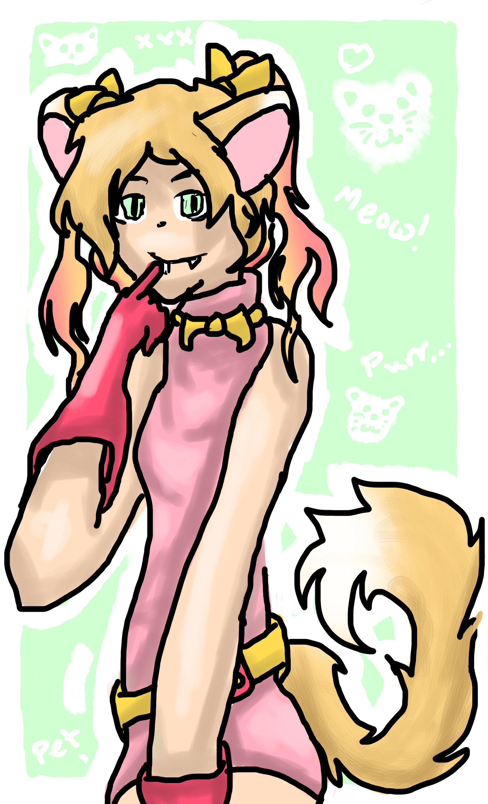
I really love this drawing,you have shown such a level of skill,determination and interest in your work,here is my critique~
Vision 4 and 1/2 stars
Your proportion overall is perfect but there are very slight details which could be improved
If you look on the elbow to my left you can see that it is ever so slightly too fat,you have however perfected the sizing of arms beforehand and so I do not need to go on about this but may I also add that the arm to the right is quite long and it may be an idea to shorten this,the arm seems to get fatter as it gets closer to the hand whereas it is usually in the reverse reaching its thinnest at the wrist point,sorry I make this sound confusing please let me know if you would like this further explained? Setting these two points aside you have really captured a really precise proportion level especially key details like where ears,eyes,mouth,nose,tail and waist should be drawn. plus the head doesn't unnaturally stick out of the head or balance on the top of the neck it is all attatched and linked at a good and reasonable size.
Originality 3 stars
Simply because this character is not your own OC therefore I had to take off 2 of the 5 stars but if I was judging this as your own drawing I would say that this is really unique and interesting and this would be a 5 star for originality,sorry to be a downer. You have however created the background yourself which I think is creative and kawaii! It also ties with the colours of the clothing which is a creative look at things!
technique 4 and 1/2 star
Okay your technique is absolutely amazing,there are very very slight details that could be changed to improve which I will list through
The eyes-Perhaps you could add different shades of green when colouring
The glove pointing towards the fangs-there is a very slight dot outside of the finger,just try to keep colouring within the lines but it is a minor detail that I only noticed when zooming in.
The shading-All the places you have shaded look great and are fabulously detailed however (mainly on clothes and face) you may want to blend these in to the colour more so they are more gradual rather than looking like two different colours tied together?? Other than that the shading is superb and you show great talent in this area
Clothing-I am rubbish at putting wrinkles in clothing,so I am one to talk,recently I have been having to do observational work to know where on earth to actually place wrinkles on drawing but I guess I know they need to be there ha ha. I think your character is wearing a tight top and therefore wrinkles are an unlikely feature but if this isn't the case you may want to add them??
There are plenty of really good points however like
Variety of brush strokes-I like the brush strokes used in hair and tail to make it appear whispy as well as the gradient effects used to make it magical and creative.
Shading-as I have pointed out previously you know all the right places for shine and shading,it does look really good but I do recommend that perhaps you make it more gradual
The ears-do you know how many people find placing ears impossible?? Adding details like bows (which you've done) ties (which you've done) tails (Which you've done) and of course kitty ears (which you've done) are really hard to place but your proportions are very perfected and you must practice alot at these,proportion is a key part in drawing people and you really are fabulous at it.
Expression-The face is not a blank canvas of emotion and this character expresses quite a bit the cheeky smile as the fangs mysteriously hang from the gums with those eyes that draw you in to the picture the hand placed gently upon the face,it tells a whole story in itself
The background-You have perfectly tied the colours of clothing to the background and yet made your character jump out of the screen its not like a flat image.
Impact 4 stars
I think the drawing is big bold and bright and certainly brings happiness to my day plus the emotions of the character are strong and she is overall a very kawaii character,the only reason a star was not added was that I didn't get as much impact emotionally as I feel could be possible,maybe next time you could create a background that attaches itself to the story of the character,this is only a suggestion however as personally I love the background there is already <3
Sorry for writing such a long critique there are a total of 863 words!
Thanks again and sorry if I were a bit to harsh,I tried to be as fair as possible
Yours
~Ducky